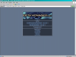
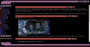
|
The
Fifth Voyager Magazine
(click
here to skip to the main site ones, this
entry is large)
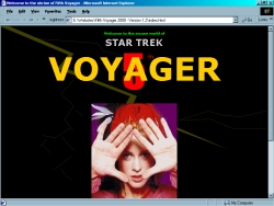
Before
Aggressions was any bigger than two pages of script in a notebook (yes,
script)
and before I purchased Web Express and used Microsoft Publisher 97
to create websites, there was the FV Magazine.
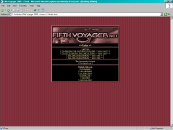
I'm
not sure when it happened but the Magazine was dumped for the actual
official site which was released with Aggressions Part 1 on Monday,
the 4th December 2000. The version you see here never got online. It
was terrible so that's not a bad thing.
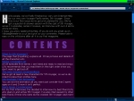
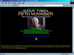
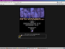
You
had to see every page on the site as it's navigation was
"previous" and "next", it had the contents page
but I don't remember if it had links there. The second thumbnail
above is supposed to be an information page, I'm the creator and I'm
still clueless as to why the pics of the cast is there (and
why one image isn't working).
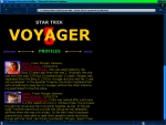 
The
first screenshot above shows the top of the cast page. Second one is
the theme animation that was made.
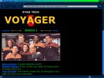 
Above
is thumbnails that listed and talked about Season One and Two
episodes. As I don't have the actual site available, just the
thumbnails I can only tell you what I remember. Season One was more
or less unchanged episode listing wise, the episode "Survival
Instinct" from Season Six was in there but was replaced by
"Prepare For Trouble". Season Two was mostly the same at
the beginning, after F9 Control Failure it was very different to the
one that exists now. Luckily if I remember right the thumbnail above
just had info about the first few only anyway, except it obviously
had "Memories" there instead of "Saturday Night".
I remember "Disconnected" being more sci-fy than
horror/fantasy, and "Resistance" being about Janeway &
Chakotay rather than James & Jessie, who didn't exist in FV yet.
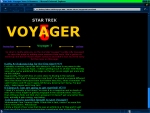 
It
just isn't a magazine without an interview, and the one above was a
fake interview with Morgan, Emma and Lilly, hence the crap title on
the second thumbnail. The first one was completely irrelevant as it
was spoilers... for the original Voyager series.

Finally
the last thumbnail was the usual "next issue" crap with
it's cover/intro image. The first I think had a full cast
"promo" pic, without Kiara, Naomi, Lilly and Emma. It just
had Morgan on at first, then a crappy picture of Craig that had to be
painted on from the waist down (and it was the wrong Craig lol). Hmm
so yeah. Moving on...
Released
- Never
Created
- mid to late 2000
|
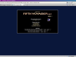
|
Fifth
Voyager - Version
1.1
(screenshot
not available)
This
version was very similar to the below version, just not in frames.
This layout was inspired by the official Star Trek site (or
nicked ^_^),
and I remember saving their index file so I could look at it on my
computer. I remember that I changed to frames so I didn't have to
update every file that had the menu on when I added a new button to
the menu.
Released
- 4th December 2000
URL
- www.geocities.com/fifthvoyager |
|
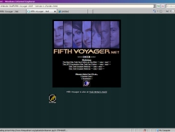
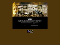
Fifth
Voyager
- Version
1.2
I'm
not sure where all my old intro animations all are, but the pic on
the intro page above is one of the early ones. Also again you can see
the old FV logo was made with regular fonts. The main page in the
frameset above isn't the main page. The only version of this site I
had, had a link leading to the new location on the homepage (same
with the next version) and that was mainly it. The page I used for
the screenshot above is actually the episode index. If you can see it
clearly, you'll notice there are four columns, one for each season. I
had Seasons 1 - 8 more or less planned out, which I found out was
very pre-mature. Seasons 2 and 3 themselves are completely different
to the ones in that episode index, well except the beginning of 2.
Season 1 is the same.
The
2014 version is a tribute in a way to this, if you're looking at
this page while it's in use you should see what I mean.
Released
- Unknown (2001)
URL
- www.geocities.com/fifthvoyager |
|
Fifth
Voyager
- Version
1.3
Once
again the menu system stayed the same in this version. Also I had
made the FV logo that is used today to put on the intro page, and in
the main page in the frameset (obviously to show it off a little ^_^).
Released
- 24th June 2001
URLs
- www.fifthvoyager.0catch.com, fifthvoyager.iwarp.com, www.envy.nu/fifthvoyager |
|
Fifth
Voyager - Version
1.4
(screenshot
not available)
I
remember this version very well. I wanted to change the site
considerably so you wouldn't recognise it. The menu was on the bottom
frame, with new images for the menu. There was a marquee at the top
of the page, and everything else was in the middle frame. I still
don't know why it isn't on my computer. I know I started working on
it on my mam's computer, and the files were on there. I'm sure I must
have done updates on my own computer, so I'm definitely stumped on
this one.
Released
- 27th September 2001
URLs
- www.fifthvoyager.f2s.com, fifthvoyager.iwarp.com |
|
Fifth
Voyager 2002
- Version
1

2002
marked the demise of the Star Trek.com inspired menus, and
introduced good old written links. Not just that, this version also
introduced a different background image and lots of OTT Paint Shop
Pro lighting effects. I should have known one day that I'd become to
regret doing those. The thing I liked the most about that version was
the episode index, and how it loaded the newest episode when you went
into it.
Released
- 4th December 2001
URLs
- fifthvoyager.iwarp.com, fv-2002.4mg.com, www.geocities.com/fv_universe |
|
Fifth
Voyager 2002
- Version
2

This
version was a big step for me. I had become so used to using frames
that it proved very difficult to do this version. I had to change the
site so there were no frames since Angelfire didn't support frames
very well.
Released
- 3rd
March 2002
URLs
- fifthvoyager.iwarp.com, www.angelfire.com/fl5/fifthvoyager |
|
Fifth
Voyager 2002
- Version
3

This
version was never going to be made when I first released Fifth
Voyager 2002. The original plan was to have three versions during the
year. This version was the result of boredom, all I wanted to do was
to change the background image but I ended up changing a lot more
than that. Of course all the images that were used on the main page
slowed the site down considerably.
Released
- 15th June 2002
URLs
- fifthvoyager.iwarp.com, www.angelfire.com/fl5/fifthvoyager, www.fifthvoyager.cjb.net |
|
Fifth
Voyager 2002
- Version
4

The
previous two versions was so very alike I decided to change the
layout for this one so it looked a lot more neat. It worked but like
every website, there was problems. The menu was only available on the
main page, and going back was a bit slow since the site's host was a
little slow on some computers (personally I didn't have any bother).
Also for 1024 by 768 users the main page was a little bare. Despite
all the problems, this version introduced a lot more features, big
and small.
Released
- 1st September
2002
URLs
- www.fifthvoyager.cjb.net, fifthvoyager.iwarp.com,
fifthvoyager.deep-ice.com, www.fifthvoyager.net |
|
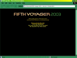
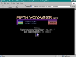
Fifth
Voyager 2003
- Version
1.0
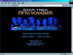 
This
layout was very cramped on smaller monitors, which is basically one
of two problems. The second problem was the amount of fiddly things I
had to do every week. This version was one of the versions that took
the longest amount of time to get the finished product. The one that
took the longest was the very first of course. This version
originally was going to keep the non-frame look but like older
versions I wanted users to be able to use the menu nearly everywhere
they go. Also I had to introduce the whole 'select which resolution
you're currently using' thing, no matter what I did I couldn't get
the frame set to work in both resolutions.
Released
- 4th December 2002
URL
- www.fifthvoyager.net |
|
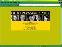
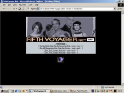
Fifth
Voyager 2003
- Version
1.1

Since
the above version was too cramped for some visitors I re-designed
the site a little to give the main frame more room. I also tried to
reduce the picture sizes to reduce loading times. I noticed a while
back that the splash page took too long to load. Ah dialup, nobody
misses you.
Released
- 20th
February 2003
URL
- www.fifthvoyager.net |
|
Fifth
Voyager 2003
- Version
2.0

This
version I totally screwed up thanks to an idea I came up with to
reduce loading time. I started again on the next design.
Never
released |
|
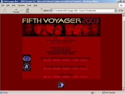
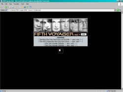
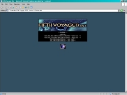
Fifth
Voyager 2003
- Version
2.1
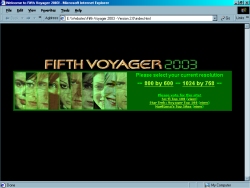 
With
the previous version (1.0, not 1.1) the main frame gave 800 by 600
users a very cramped look. Version 2.1 was designed to give the main
frame more room, yet keep the entire menu available. The idea to have
links to the major pages at the top, to have now showing and other
stuff in the home page, and finally have the little pages on the
bottom frame came to pass. The idea worked, the main frame wasn't as
cramped, plus everything worked where they were placed. The only
problems I can think of for this version was the colour (green isn't
usually an attractive colour for a site), there were too many images
for it to load, and because of the separate menu systems it was a
little harder for me to update the files. Besides from all that the
version was a success, and I got several positive comments about it.
For the record nobody complained about the colour unlike what I
expected ^_^
Released
- 12th
March 2003
URL
- www.fifthvoyager.net |
|
Fifth
Voyager 2003
- Version
3.0
(Accidentally
deleted version)
Damn
I wish I had made a screenshot of it ^_^ The folder for this version
was a victim of war between my computer and my mam & I. For some
reason it didn't move to my backup drive like the rest of my websites
did, so it was deleted during the format.
Never
released |
|
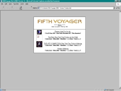
Fifth
Voyager 2003
- Version
3.1
Started
off well, but it ended up looking too much like the last version.
Work was restarted again. As you can see there's some screenshots of
this one... The site was going to open up in a new little window.
Never
released |
|
Fifth
Voyager 2003
- Version
3.2
My
eyes!
That's
all I can say now. My old big bulky monitor was a lot darker than my
current LCD one, yikes.
Released
- 14th
June 2003
URL
- www.fifthvoyager.net |
|
Fifth
Voyager 2003
- Version
4.1

This
version isn't much different to the one below, menus are in
different places and it looks like I was going to put more images
into it.
Never
released |
|
Fifth
Voyager 2003
- Version
4.2
2002
Version 4.0 was the first version that had a seasonal colour. Like
that version this version had gone Autumn Red. The menu and the
Episode Archive had changed dramatically to make updating easier for
me, and everything easier to find.
Released
- 13th
September
2003
URL
- www.fifthvoyager.net |
|
Fifth
Voyager 2003
- Temporarily
Closed Version

Nothing
much to tell really, this was a temporary layout that was barely
around. It was only introduced to replace the 'close site for a week
while I finish off FV 2004' idea. It did however inspire me to stop
working on the original FV 2004 layout and work on another, another,
and then another lol. The top banner was used for the forum that was
hosted elsewhere, when the forum started fresh here it got a
different look. It's a shame, I still like the banner.
Released
- 15th
November 2003
URL
- www.fifthvoyager.net |
|
Fifth
Voyager 2004
- Version
1
The
original FV 2004 design. It took me ages to make the main frame, it
doesn't look much in the screenshot but believe me it was
complicated. I loved this design until I started working on the
forum's second design, the amount of purple in the forum made me look
at the site and I felt it had the same problem. Several people
suggested breaking up the purple with whites, blacks and more
importantly blues, the second design was started not long afterwards.
Never
released |
|
Fifth
Voyager 2004
- Version
1.1
After
researching lots and lots of other websites to get inspiration, I
finally came up with a new design. For a few days I was impressed,
but in the end it just looked common as muck and I felt it wasn't
going to last a few weeks let along most of the year. Work started again.
Never
released |
|
Fifth
Voyager 2004
- Version
1.2

The
intro page for the current design was very similar to this one, and
the previous one may I point out (that's why there's no screenshot of
it). My point is that there was a lcars system in the intro and when
you went into the site you would find a run of the mill site (the one
above). This one was created to include button menus, plus written
menus also. The main page was taken from the original FV 2004 design,
and of course the top banner from the previous one stayed in. For a
day I was impressed, but like before I wasn't happy with it, so yes I
started again.
Never
released |
|
Fifth
Voyager 2004
- Version
1.3
More
research took place to create this design. I decided to keep the
menu from the last design, which took me hours to get right believe
it or not, and remove the top banner as it was taking up too much
room on 800 by 600 screens. One of the sites I got inspiration from
gave me the idea of putting a banner in the middle of the page, aka
the main page. That way it would only be in the way on the main page
and nowhere else. The main page's design (with the small fonts, less
text than previous versions etc) came from the temporary layout that
was before this one. That's all I really have to say about this one ^_^
Released
- 4th
December 2003
URL
- www.fifthvoyager.net |
|
Fifth
Voyager 2004
- Version
2

Believe
it or not but this did take a lot of time as there's lots of frames.
The colours were a bit off but I was working on the layout at first.
Once I finished there was something about the whole thing that put me
off keeping it. I didn't bother editing the colours in the end ^_^
Never
released |
|
Fifth
Voyager 2004
- Version
2.1
The
pictures don't really do the this version justice, trust me. The
splash page is the one Version 1.3 was using for a short while. The
forum was changed to match the site, the top banner was exactly the
same but the menu was replaced with a blue box with "forums"
and a few characters pics.
Released
- 24th
May 2004
URL
- www.fifthvoyager.net |
|
Fifth
Voyager 2005 - Version 1.0
This
one was just the basic layout idea for 2005 Version 1.
Never
released |
|
Fifth
Voyager 2005
- Version
1.1
I
wasn't entirely sure about this one. I liked it, but it didn't seem
like a style that'll suit FV. All I did was the layout, I hadn't even
gotten around to finishing the top banner.
Never
released |
|
Fifth
Voyager 2005
- Version
1.2
Another
favourite of mine, the site usually turns out pretty sweet looking
when it's using the red scheme ^_^ It had a basic design: the top
banner, a small menu that would change if you clicked
"Information" for example, then the main home frame. The
home page had a 3Dy box effect which I loved and tried to re-create
on future versions. The top banner was cool too, there's not many
that I still like - I get sick/tired of them quickly, and I usually
spot mistakes that annoy me. Not this one.
Released
- 4th
December 2004
URL
- www.fifthvoyager.net |
|
Fifth
Voyager 2005 - Version 2.0
Simple/plain
splash page, simple/plain box frame style site. It worked I suppose,
but it just wasn't good enough to last the six months, it did but I
was glad to move on.
Released
- 13th
June 2005
URL
- www.fifthvoyager.net |
|
Fifth
Voyager 2005 - Closed Version

Just
for three days the site closed to allow me to upload files, delete
unneeded ones without anyone noticing, and test the new ones. Simple,
but it's not meant to be more than a ten minute job is it ^_^ The FV
logo was resized to be bigger for once, it's usually made smaller in
graphics, and I was expecting a big stretched glitchy mess but it
didn't look too bad at all. That thing is indestructible and
constantly reusable lol, not bad for an image I made in 2001.
Released
- 1st
December 2005
URL
- www.fifthvoyager.net |
|
Fifth
Voyager 2006
- Version 1.0

There
must have been some reason why this wasn't chosen to be released. I
found it again just recently and adored it. Apart from the banner it
was a bit, simple... er than usual. The banner is nice, but you can
see even in the tiny screenshot that the background that was supposed
to mix the banner with the rest of the menu kept repeating itself
badly, it doesn't look too great like that. Plus the design I guess
looked very empty in widescreen resolution, it looks like that in
1024 by 768 so there you go, that's probably the reason.
Never
released
URL
- www.fifthvoyager.net |
|
Fifth
Voyager 2006
- Version 1.1

The
only splash of colour on this little framed wonder was the good old
FV logo and the links. I couldn't decide on a colour scheme, so
black/white/grey took over. The design itself isn't half bad, it just
had too many frames and scrollbars in it. Also the splash page was
removed to hopefully keep visitors from leaving right away without
seeing anything.
Released
- 4th
December 2005
URL
- www.fifthvoyager.net |
|
Fifth
Voyager 2006
- Version 2.0

The
new site design was a part of a surprise gift for all of my patient
readers, FV had been pretty lacking in the episode department for
years and I wanted to do something special. I've tried to do
marathons in the past, but this one more or less worked and it came
wrapped in this pretty red package as well. This design helped FV
break a tradition that's been around forever, a new design always
appeared on the 4th December, the site's birthday, but I was still
loving the current design and I didn't want to change it. Obviously
it had to go sometime as I was finding problems with it. A new forum
template was going to be made to match this on the site's birthday
instead, but as the forum itself was being fixed around about that
time, and I was working night shifts I didn't have the time to do it.
Until
the huge writers block from 2007 to 2011 this site design was around
the longest. Once again the red designs are usually the best, I
should remember that.
Released
- 24th July
2006
URL
- www.fifthvoyager.net |
|
Fifth
Voyager 2007 - Version
1.0

As
I had 2006 2.0 to beat, it was very difficult to create a better or
just as good design. The first attempt was this. I loved it, but it
had the same problem as the last: the menu would have to be added to
almost every page, making updating the menu annoying to do.
Afterwards I tried many framed versions of it, none of them got far
at all, I always ended up back at this one. After a few more tries I
came up with 1.2, which I loved for a while but amazingly despite me
saying that it would be this one I'd get sick of quickly, it was that
one it happened to.
Before
then I had posted a poll on the forums so viewers could pick between
this and 1.2, only one voted for this, others voted for both or
neither. People I talked to preferred 1.2 just cos of the colour
scheme, because it was framed or the banner used on it. I dumped it
only because I was never fully happy with the banner. Changing the
menu that was apart of it would require even more work, the logo
looked badly placed on it, the bordered tables were a faff to do on
every page... you get the idea. In the end I decided to re-do this
design with the lucky colour scheme (red) and a fixed menu which
could be changed easily.
Never
released
URL
- www.fifthvoyager.net |
|
Fifth
Voyager 2007 - Version
1.1

This
was the best attempt at making the site full screened and framed.
The idea was to have a repeating image at the top, with the main
banner in the centre of it... in any resolution it would look like
the banner was the same size as the window. I couldn't make a decent
enough background image for the banner that went with the design, so
it was scrapped. Like I said above, I went back to 1.0 before
restarting once again from scratch. I toyed with the resizing
images/frames with resolutions idea for the current 2014 version,
it's a little more subtle though.
Never
released
URL
- www.fifthvoyager.net |
|
Fifth
Voyager 2007 - Version
1.2
For
a while I was in love with this design, then one day I looked at it,
and felt 1.0 was miles better. Screencapping all the designs for this
page made it official, it looks awful in screenshot form. It's too
blue, plus the blue in the main page doesn't work with the
banner/background image. I never liked the placing of the FV logo,
and the image mapped menu would have made it difficult to update the
menu, I would have to redo the banner to do it.
Never
released
URL
- www.fifthvoyager.net |
|
Fifth
Voyager 2007 - Version
1.3
I
finally decided to return to 1.0, and redesign it once again.
Starting afresh never seemed to work out. This time I decided to
change the background color, the blue one annoyed me now, also the
colour scheme. Red's always been a lucky colour with FV site designs
(funnily enough 2004 did fine with blue ones but never mind, all
other red ones worked out well). The banner had been made a while
ago, it didn't fit as well with the new colours, so was recoloured
itself. The menu was fixed so that it was a separate file, making
updating it very easy. Other minor changes were the go to the top
link at the bottom of each page (since it's not framed, getting to
the menu on long pages like this one is annoying), centering almost
everything, somebody commented that the 1.2 design was better because
of that so... I did and it did look better. Also the headers were
formatted like the menu, which is fiddly.. so I didn't bother with
that this time. Since I did like what I did with the news and guides
section with the frames with 1.0, I brought them into this version too.
Released
- 22nd
April 2007
URL
- www.fifthvoyager.net |
|
Fifth
Voyager 2008 - Version 1.0
(no
screenshot found)
Inside
the 2009 version of the site I had information on this and the other
2008 version. However there were no images for it. The next version I
had available on my computer and the laptop was the 2011 one, which
had no page like this. It looks like the screenshots were other
vicitims of my home computer crash of 2012.
Information
from 2009 Version 1: The home frame just looked awful no matter what
I did, I was worried about the purple border image repeating itself
on the right on wider resolutions, and the menu was just crappy. So
yeah this didn't last very long once it was finished, I just print
screened it for this section and started on a new one.
Never
released. |
|
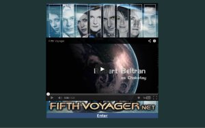
Fifth
Voyager 2008
- Version 1.1
(no
screenshot found)
Like
above, screenshots for this version are lost. The only thing I have
left is the splash image I think is from this design. I can't find
the design it belongs to and I know it was part of a released design
(it wasn't new in the 2013 one).
Information
from 2009 Version 1: I've
been wanting to do a full screen design for this site for ages, but
always failed. You want to know why? See 2006 Version 1.0. You just
have to make the right banner, which will go with a background image
so it'll look right in every resolution. That version was the only
one that came close, and it's so awful in any resolution that's in
its 1000's. Never mind, there's always next year. For 2008's I had
already made a banner that I liked, so I just began a simple, inline
frame home page design like the black/grey design a while ago. Only
this time that is the only frame, with the exception of the episode
archive which stays the same. After messing around with the banner I
had already made, to see if I could come up with a colour/theme for
it to make it look different to past designs, I did come up with
something. The menu is the big change, and when I say big I mean it
in two ways. It's a big menu, there's a reason for that.. it's what
makes the design look even better. The only problem with this design
is that while trying to think up a design for 2008, I grew tired of
trying to accomodate to 800 by 600, while still trying to make it
look great in 1024 by 768. I was lucky however, when I tested it just
to see how bad it looked in 800, only the home page frame's scroll
bar is out of view.. the rest of it fits. It does look very cramped,
but a site that doesn't look cramped in that resolution is going to
seem empty in any resolution bigger than that.
Released
- 4th
December 2007
URL
- www.fifthvoyager.net |
|
Fifth
Voyager 2009 - Version 1

Nothing
much to say really. I really loved the previous version, and after
suffering from months of writers block I was left with a very close
deadline. Naturally a simple redesign of it updated the site's look
for 2009, leaving me more time to write (A/N in 2013 hindsight: lol).
The changes include: swapping the menu and home frame so the menu
boxes in the site's content, new colour scheme, new images, and a few
new pages. Simple but enough.
Looking
back at it in 2013, this site design definitely ranks as one of my
favourites. My only complaint is the excessive menu, though it was a
nice looking gigantic menu. Like the one below, the last update for
it that I got backed up from my broken computer, was not long after
it was released. This version was updated a little, I remember that
much. I imagine as I can't find it at all on my laptop, this design
died along with my broken computer. Somehow it also took my 2008
screenshots with it, but none of the others.
Released
- 4th
December 2008
URL
- www.fifthvoyager.net |
|
Fifth
Voyager 2011 - Version 2

Naturally
there's no folder for Version 1, I assume it existed at some point
so I'll keep this one's name regardless. I really liked this version,
but only for its banner/menu design. However it just brings back
pretty awful memories of the writers block. This version was the big
come back that the 2013 version ended up being, but it all went
horribly wrong. It wouldn't be so bad if it wasn't for the fact that
I couldn't even bring myself to update the site after 6th December
2010, so it was like that, advertising new episodes that never came
for at least a year. I remember putting a very basic temp design in
its place, just to get rid of the depressing thing until the real
comeback came along. I have no idea where that is. Anyway these last
two represent a sad chapter for me really.
Released
- 4th
December 2010
URL
- www.fifthvoyager.net |
|
Fifth
Voyager 2012 - Version 1

Only
labelled as Fifth Voyager 2012 on my computer, this version was
already the final design for many months. It was 2011, Aggression was
completed, some episodes were edited. I thought I was more than ready
to bring the site back for its birthday. It was just a simple design,
and I was more than happy to keep it that way. When I got it into my
head that I wanted to comeback with more than just Aggressions and an
updated Half of the Heart, I moved the comeback to 2012. It was only
in those later months I thought about making a more flashy look. I
ended up scrapping it, later leaving a blind panic for a half decent
design on the 4th. What ended up online was very similar to this.
Never
released. |
|
Fifth
Voyager "2012" - Version 2.1
(screenshot
not available)
Instead
of using lcars I thought about using Voyager itself in the design.
Basically sections of the ships could be clicked and would lead to
other pages. I didn't get very far, at all. Don't ask for a
screenshot, just google USS Voyager and you'll get the jist of how
far I got.
Never
released. |
|
Fifth
Voyager "2012" - Version 2.2
Does
it look familiar? If yes then you were aquainted with the 2013
design. The banner was a lot larger here and a different colour. I
was trying to get a nice reddish design, as my luck with them was
pretty good. It failed me this time as I couldn't get the look I
wanted. My laptop had a more up to date version with a bigger menu,
also including a home page. The home page had some date codes I
couldn't get to fit in properly. Also I couldn't get it to work as
Date/Month/Year as I didn't know how to get th/st after the date. I
think it was dumped when I moved onto the final design.
This
banner appeared in a lot more versions that never got finalised, I
was determined to use it which hampered a lot of my ideas for designs.
After
this version I remembered that I had the year number wrong in the
names. I was working on these early 2012 and I was out of practice,
so mistakes like this will happen.
Never
released. |
|
Fifth
Voyager "2012" - Version 2.3
(A)

This
is very similar to the one above. The top banner was resized, the
design along with it. This one looked better than above but the
frames were removed so every page, excluding the episode archive,
would have to have the menu and banner on the top of it. Also the
website looked tiny on my laptop which has one of the lowest
widescreen resolutions on it, so I think you can see where I'm going
with this.
The
reason why the version has A in its title was I was working on
another design at the same time, both of which ended up in the same
folder. I've no idea why I did that either.
Never
released. |
|
Fifth
Voyager "2012" - Version 2.3
(B)

This
is what happens when I try to be different. I don't yet I make a big
mess all the same. Like above this version was mostly frameless. The
banner sat at the top, dates underneath, then the episode showing
& news column. Finally the menu would sit at the bottom of this
frameless page where most people would not see it unless they
scrolled. The menu was vertical as well, so it left room for another
box like that one on the right with update info.
Needless
to say, I didn't spend anymore time on this thing.
Never
released. |
|
Fifth
Voyager 2013 - Version 1
Fifth
Voyager came back to life in this. It was nice enough, but half way
through 2013 I was already working on another one. The intro image
was taken from an earlier version, I think the missing 2008 version I
mentioned. This design was basically a more up to date version of
2007's, I had even re-done that same banner. I've already mentioned
that I was in a hurry to pick something, and I was rusty as hell. I
know a lot of my designs are a bit same-ey anyway, so that's probably
why I had trouble. Nevertheless this one was more than okay to last
the year.
Released
- 4th
December 2012
URL
- www.fifthvoyager.net |
|
Fifth
Voyager 2013 - Version
2

Like
the previous year I thought about using lcars in the design, this
was the first one that I didn't give up on right away. For a while it
was going to be the one, as evidenced by the home page on the right
having text in it. The right box was an inline frame so everything
but the Episode Archive would go there. I dumped this design mainly
because I wanted it to fit on every resolution so it wouldn't be lost
on larger ones. I failed. Also the menu text was a custom font, and
it still didn't look right.
Never
released. |
|
Fifth
Voyager 2013 - Version 3

I
tried again but as you can see, I didn't get further than the menu.
I think the idea was that every link would focus in on Voyager. News
would be a zoomed in shot of the Conference Room. When I say zoom, it
would be as instant as an image loading. I don't do flashy things
like that, haha. Anyway I started again, using the same "code
name" 2013 Version 3 but that later became the current version
now known as Version 2014.
Never
released. |
|
Fifth
Voyager 2014
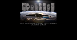  
This
is definitely up there as one of my favourite designs, and so it has
lasted a fair few years. It was inspired by and a tribute to the
original (not The Magazine) design, launched in 2000.
It
has been altered over the years to try and adjust to more modern
ways of browsing. I figured that FV is a fanfiction site and as such
should be readable and useable on portable devices too. Some people
prefer to read on computers and some prefer on their phone, so I had
to accomodate. The issue is I haven't been up to date on website
design for over a decade. I don't use CSS, PHP or anything flashy
that could help make a mobile version work better. All I figured I
could do was make a bare bones mobile version, separate from the main
one and give the option to choose. I personally would prefer to have
the choice as I tend to hate mobile designs. The full website
remained largely unchanged until now, what with the newer version
making use of the far superior mobile menu.
Released
- 4th
December 2013
URL
- www.fifthvoyager.net |